

Mobile UI/UX Design
One hand, in sunlight, on a moving train, with a notification arriving. That is the design brief, and most of it never makes it into the document.
- Typical duration
- Six weeks to five months
- Team shape
- A designer and a mobile engineer
- Starts with
- Watching people use the current app
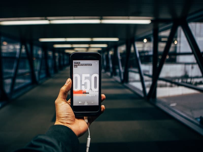
Mobile design is mostly about constraints nobody writes down
A screen is small, an audience is one-handed, an interruption is constant, and the platform already has an opinion about how navigation and gestures should work. Design that ignores the platform's opinion produces an app that feels subtly wrong in a way users cannot name and do not forgive.
So we design on each platform's conventions rather than imposing one look on both, and we do it with a mobile engineer in the room from the first week. States are specified as part of each component — empty, loading, offline, permission denied — because on mobile those are not edge cases. What we produce is a component set with tokens the codebase reads, not a set of screens that engineering will have to interpret.
What usually goes wrong, and what we do instead
The pattern is consistent enough that we now staff against it from week one.
Where mobile design comes apart
- One design imposed on both platforms, so both feel slightly foreign
- Screens drawn on a large laptop and never seen on a small phone
- Offline and permission-denied states left for engineering to invent
- Touch targets and one-handed reach checked after the layout is fixed
- A design file and a codebase that drift apart within one release
How we work instead
- Each platform's own navigation and gesture conventions respected
- Designed and reviewed on real devices, including small and old ones
- Every state specified as part of the component, not after it
- Reach and target size treated as constraints during layout
- Tokens as one shared source that the design file and code both read
What we do
Design work that ends in something buildable rather than something presentable.
Research in context
Time with people using the product where they actually use it, which is rarely at a desk.
Flows and navigation
Structure worked out on each platform's own patterns before any visual design begins.
Interaction and gesture
Reach, target size and gesture conflicts resolved while the layout can still move.
Interface design
Screens designed against real content, with offline, loading and denied states specified.
Design systems
Components and tokens in a form both apps consume, with the rules for extending them.
Accessibility
Dynamic type, contrast, VoiceOver and TalkBack treated as design constraints rather than an audit.
What you end up with
Stated from your side rather than ours.
Designs that survive contact with engineering
Because a mobile engineer was in the room while they were drawn, the states are specified and the layout has met a real device.
An app that feels native on both platforms
Each one follows its own conventions, so neither audience gets the version that was ported to them.
One source of truth for tokens
Design and both codebases read the same values, so a change happens once rather than in three places that drift.
Accessibility built in, not bolted on
Dynamic type and screen-reader paths were constraints during design, so meeting the standard is not a remediation project.
How the work runs
The same five stages as every engagement, applied to a mobile interface.
Diagnose
Who uses this, where, on what device, and where the current app makes the job harder than it is.
Decide
Navigation, component boundaries and how far the two platforms diverge, agreed before visual design.
Prove
One real flow designed, built and put on a device in the hands of someone who does the job.
Deliver
Screens and components produced in slices, each built alongside the design rather than after it.
Hand over
Your team designs and builds the next screens with us watching, then without us.
What you get
Grouped by what it is for, rather than by when it arrives — this work produces a system, and the parts of a system are not sequential.
Research and structure
What we learned, and the decisions it led to.
- Findings from watching people use the product in context
- Navigation and the main flows, per platform
- Where the platforms diverge deliberately, and why
Interface
The screens, with the parts that are not the happy path.
- Designs against real content, at the device sizes you support
- Offline, loading, empty, error and permission-denied states
- Prototypes on device for the flows that were tested
The system
What your team keeps and extends.
- A component set with documented states and rules
- Design tokens in a form both apps and the design file read
- Motion and gesture specifications, not just static screens
Evidence
What makes the accessibility claim checkable.
- Contrast measured across the palette, in both themes
- Dynamic type checked at the largest supported size
- VoiceOver and TalkBack paths for the main flows
The rest of our mobile work
A mobile engagement rarely stops at one of these. These are the ones next to it.
Related work
Engagements where the interface was the part that had to be got right.


CipherCru has been a trusted technology partner for us because they understand that successful software delivery goes far beyond writing code. Amit and his team bring strong engineering judgement, ownership, and transparency to every engagement. Whether we are evaluating an opportunity, designing a solution, or delivering for a client, we can rely on CipherCru to approach it with the same level of responsibility we would expect from our own team.
Questions about mobile design work
The ones we are asked most often before a first conversation.
Should iOS and Android look identical?
Can you design it and let our team build it?
We have designers already. What would you do?
How much user research is included?
What accessibility standard do you design to?
Do you specify animation as well?
App that works but does not feel right?
Tell us who uses it and where. We will tell you whether the problem is the screens or the system underneath them.